i’ve stopped trash talking comic sans after learning the font is actually one of the only dyslexia-friendly fonts that come standard with most computers and i advocate for others doing the same
In the event that you would like to continue hating Comic Sans, other dyslexia-friendly alternatives include Arial, Verdana, Tahoma, Century Gothic and Trebuchet.
thank
Random fact: Verdana is one of the few fonts which was specifically designed to be as easy to read as possible, even at smaller type sizes. It was designed this way for use on screen, but the same principles apply in print too. This is part of why some Universities use Verdana as their default font for documents.
“In the event that you would like to continue hating Comic Sans” is one of the best things I’ve ever read on this website
Century Gothic and Trebuchet are both quite handsome typefaces.
I’m partial to Century Gothic as well. It’s serif, but not boring.
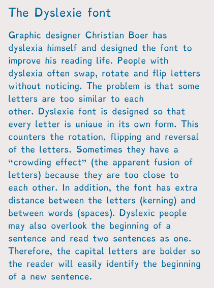
There’s also a dyslexic font designed especially for dyslexic people to read.
You can install on your tablets, laptops and browers etc, so not only can you change things like documents into it, you can change websites into that font as well!
I’m sure you’re bright enough to do a google search, but since I’m dumb enough to forget to post a link, here it is. Better late than never
I default to arial for this reason, but I will now be defaulting to verdana or dyslexie. nice.
I don’t think I have dyslexia but that dyslexie font was the easiest fucking thing to read ever. Books should be written in that shit.
ALSO!!!
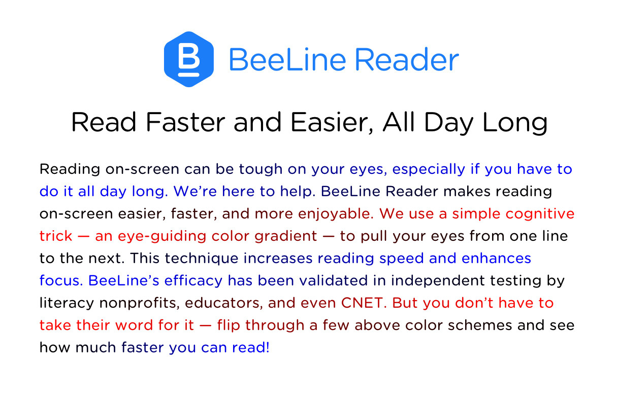
For computer reading, when you mix up lines of text, there’s a web browser app called Beeline Reader. It looks like this
The colors are also customizable, to an extent and while I don’t have dyslexia, I have adhd which makes reading large amounts of text harder and this helps A LOT.
Parkland Students Give Surprise Tonys Performance After Teacher Gets Award
Melody Herzfeld, a drama teacher who hunkered with her students in a classroom at Marjory Stoneman Douglas High School in February as a gunman massacred 17 people in its hallways, accepted the excellence in theater education prize at the Tony Awards on Sunday evening.
She said that receiving the award, which is given annually to a K-12 theater teacher by the Tony Awards and Carnegie Mellon University, was one of her life’s most significant moments.
Ms. Herzfeld, who will receive a $10,000 prize for her theater program, has been responsible for more than 50 productions at Stoneman Douglas since 2003 [and saved 65 of her students the day of the mass shooting]…
During the main event, Ms. Herzfeld’s students surprised the audience, singing an emotional rendition of “Seasons of Love,” from the musical “Rent.” They received a standing ovation, and left some in the crowd in tears.